
Meadows
Branding
Graphic Design
Packaging Design
Social Media
THE PROBLEM
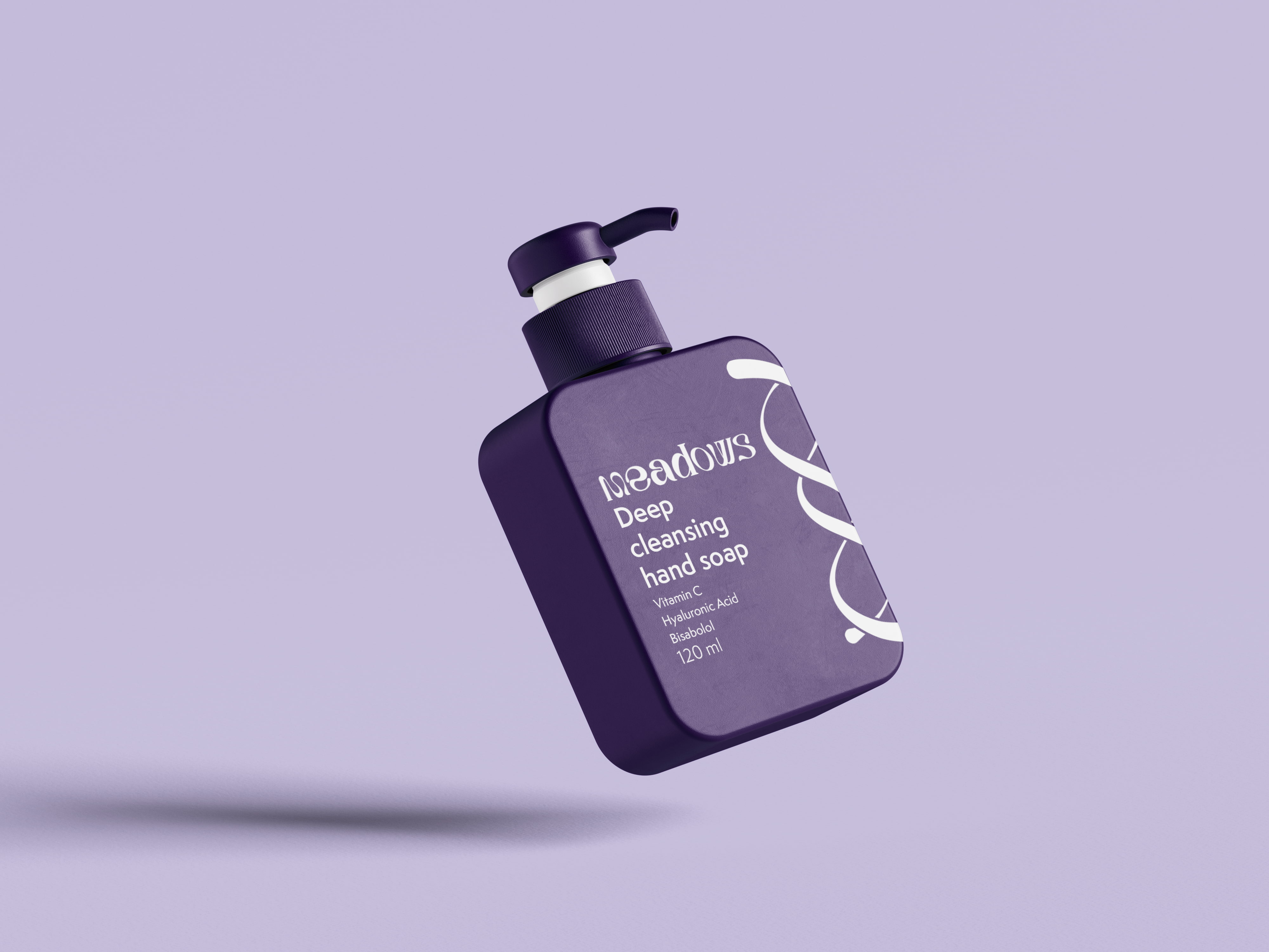
Meadows is a skincare brand, centered around the idea of bridging the luxury skincare experience with cutting edge technology, to provide an experience tailored to the customer's DNA. They required a full brand identity, a set of packaging for a variety of products, as well as mock-ups of social media activations.



THE SOLUTION
The logo went through many iterations before landing on the finals double helix, the symbolism picked to represent the DNA aspect of the brand. We wanted to give the branding an otherworldly feel, which informed the customised Great Warrior typeface, which felt both classy and alien. Purple was chosen as the core brand colour, to help the brand feel both regal and sci-fi, equally high science and high society.